How to Use High & Low Contrast in Your Color Palettes
DESIGN

STORY BY VIRGINIA BESHEARS
One tool every design enthusiast should have in their toolkit is contrast—the difference of value or brightness between colors. The level of contrast in a space can greatly influence the way we feel within them.
Read on to learn how to use contrast to set the mood of your room, plus plenty of past ORC projects that nail use of contrast.
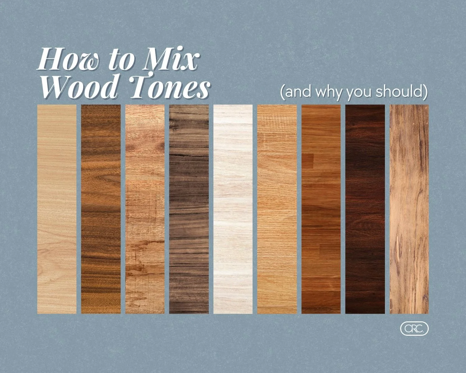
Extremely brief color theory crash course
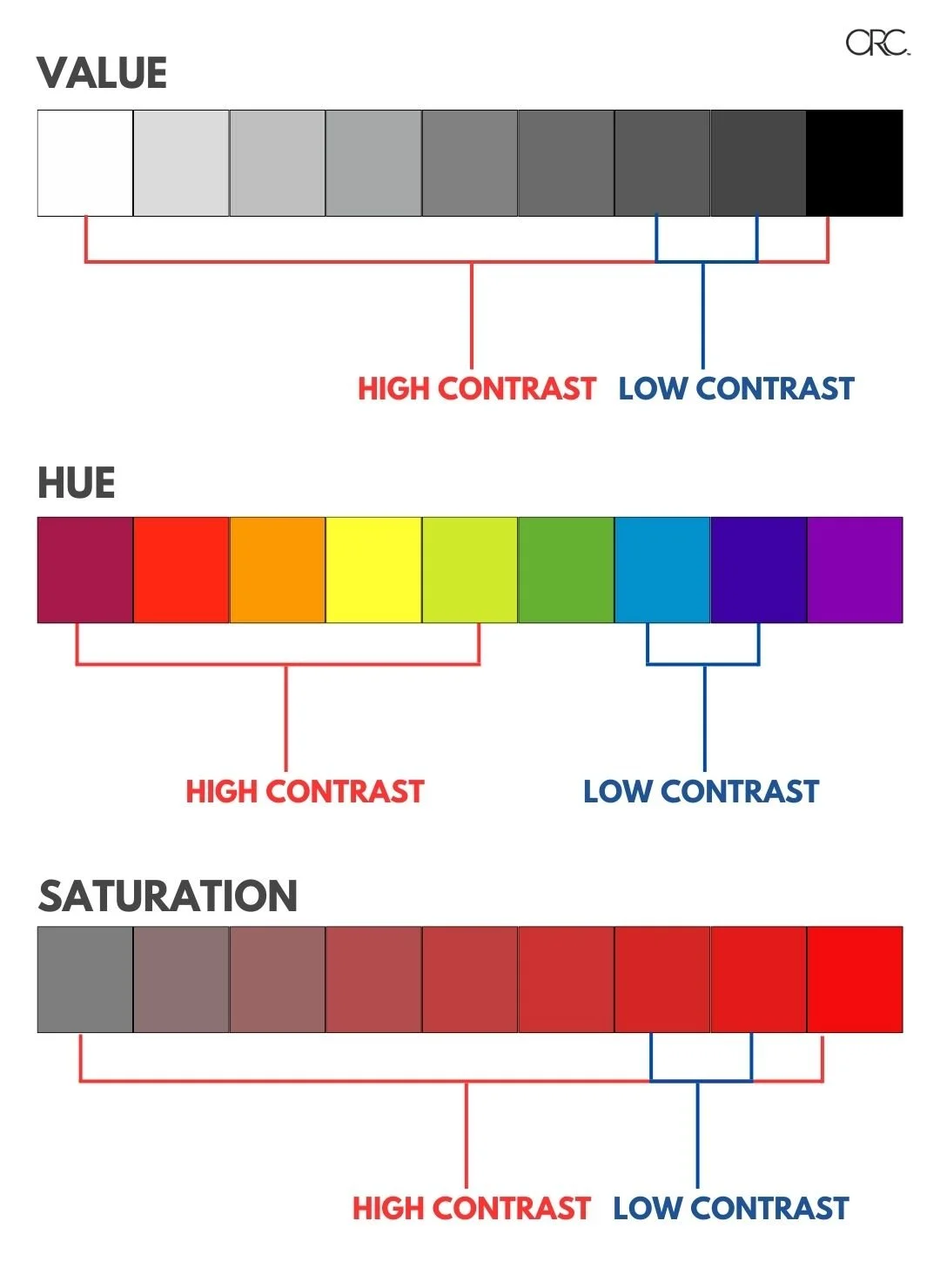
Every shade of every color has three main properties: value, hue, and saturation.
Value is the lightness or darkness of a color. Hue is where the color falls on the color wheel. Saturation is the percentage of pigment, with 0% being gray and 100% being the pure color.
With value and saturation, the further apart they are on the scale, the more they contrast.
With hue, colors that are across from each other on the color wheel (aka complementary colors) have the most amount of contrast, and colors next to each other have the least amount of contrast.
Even though you may already know all these terms, it’s always helpful to see it laid out like this, especially when you’re thinking through building a color palette.

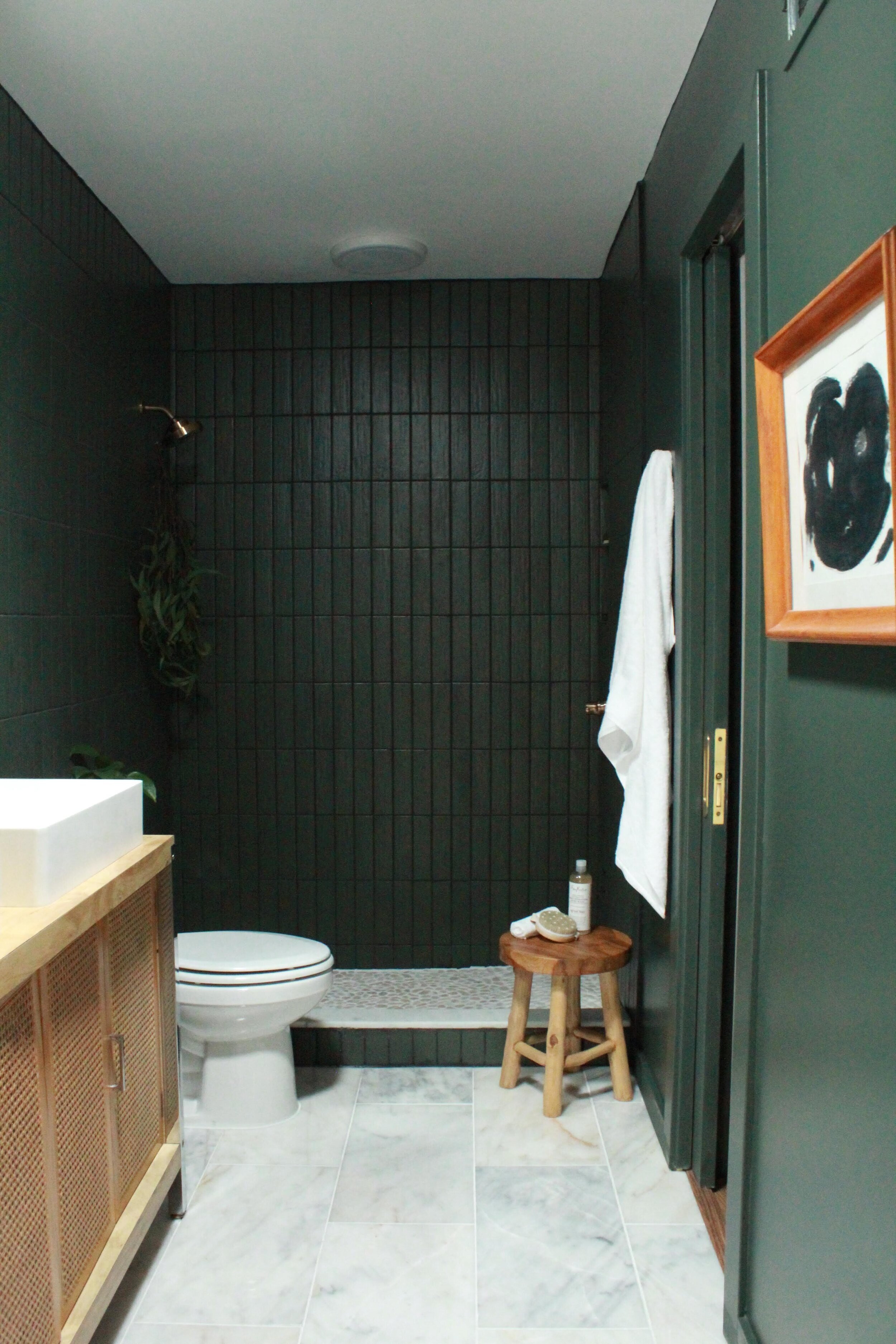
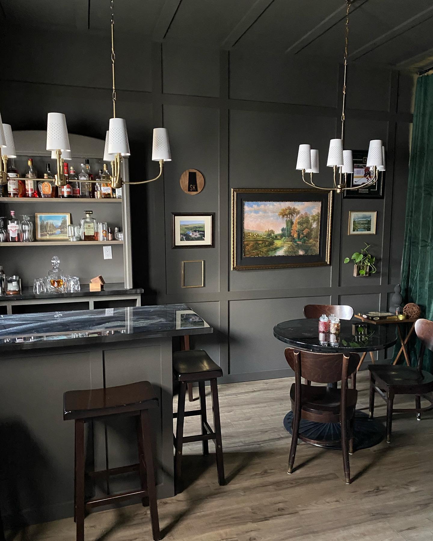
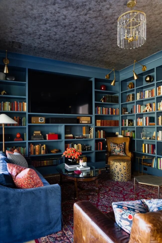
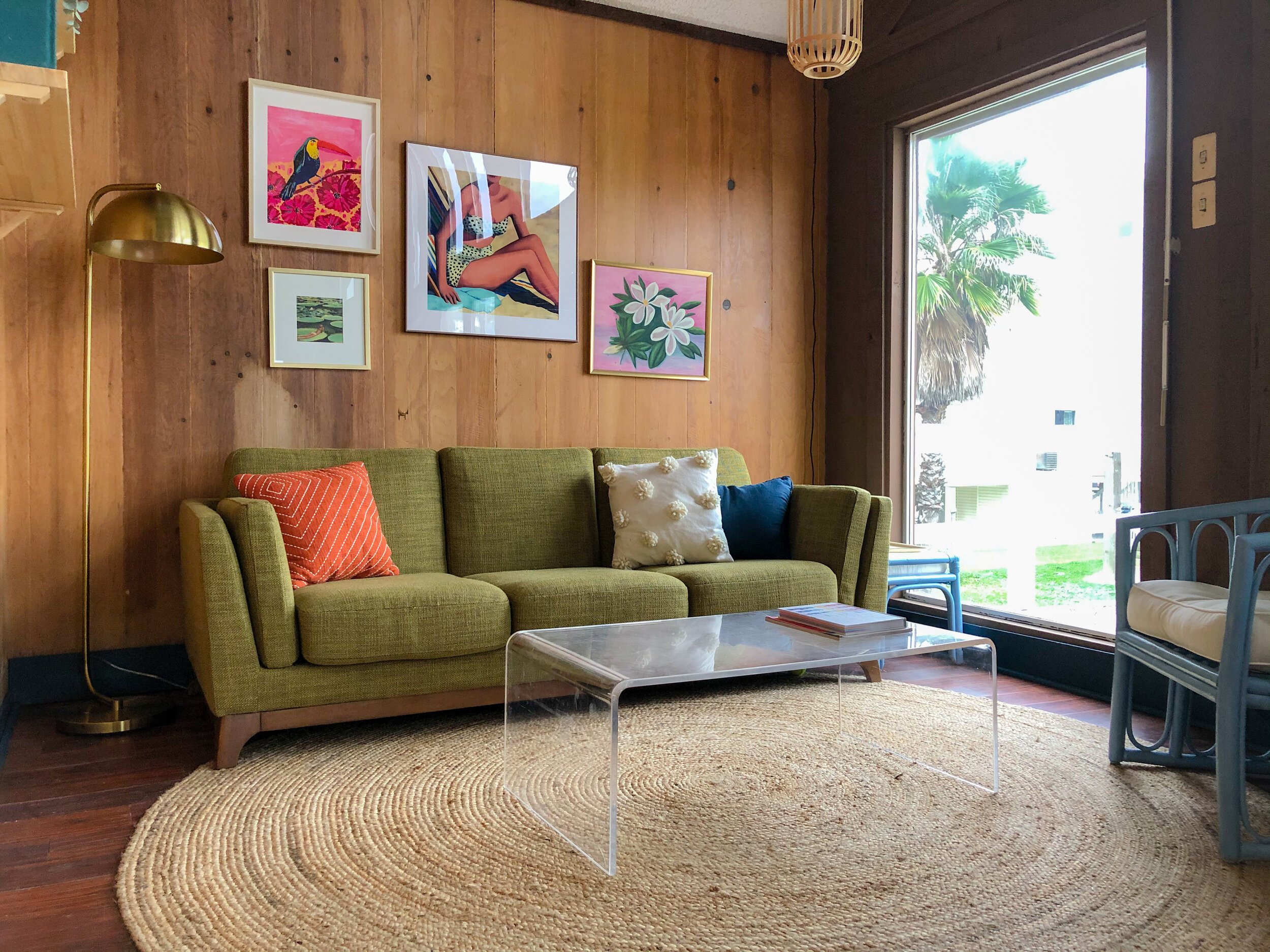
High Contrast: Bold and Dramatic
The high contrast approach involves using colors that differ greatly from each other. High contrast palettes usually have two main contrasting colors (ex: one very light and one very dark) with accent colors chosen carefully to not detract from the effect.
A high-contrast color palette in interior design makes a bold and dramatic impact in a space. High-contrast colors, like black and white, or deep blues and bright yellows, create a sense of drama and excitement in a room. They tend to make a space feel lively and energetic.
High-contrast palettes are perfect for those who want a modern, edgy, and impactful look in their home. It's all about embracing the vibrancy and making a memorable design statement.
Other ways to bring in contrast beyond the color palette include incorporating contrasting textures, such as pairing glossy surfaces with rough materials, and combining different shapes, like a round table with angular chairs.

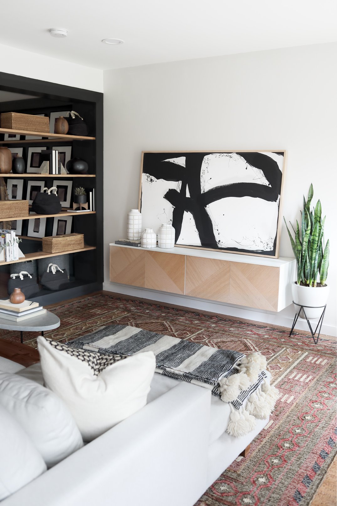
VIA MIDWEST ECLECTIC
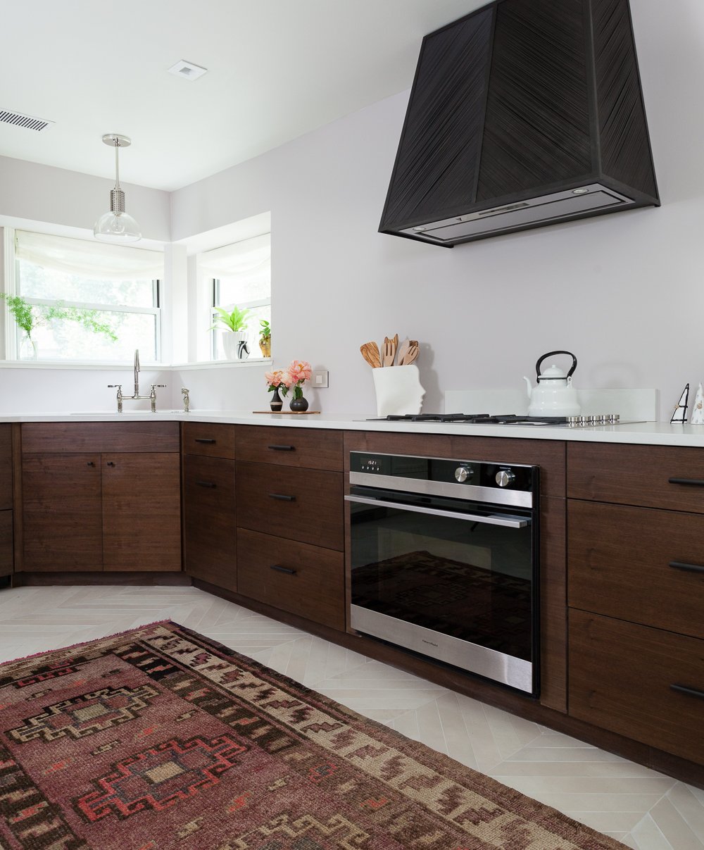
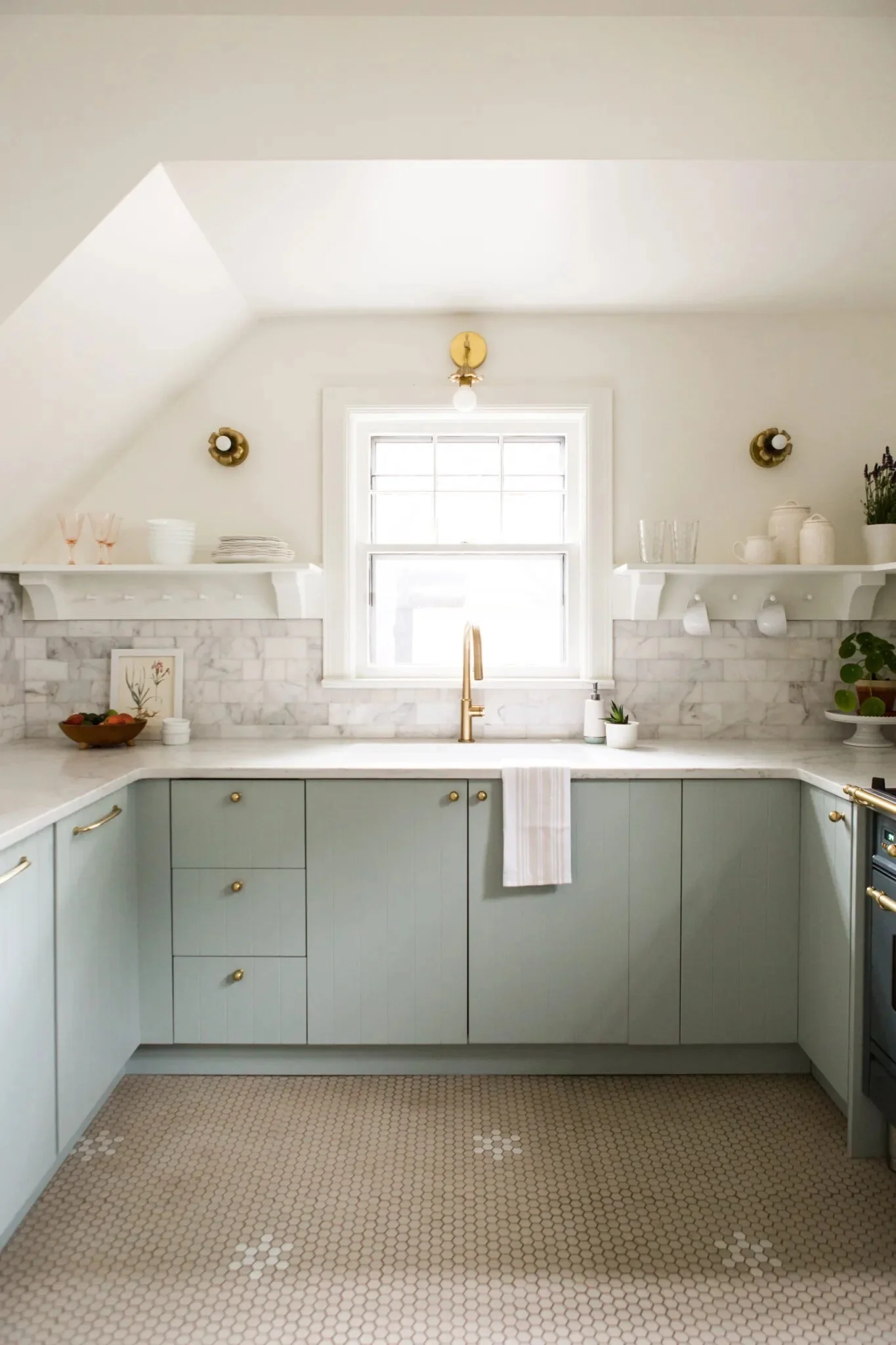
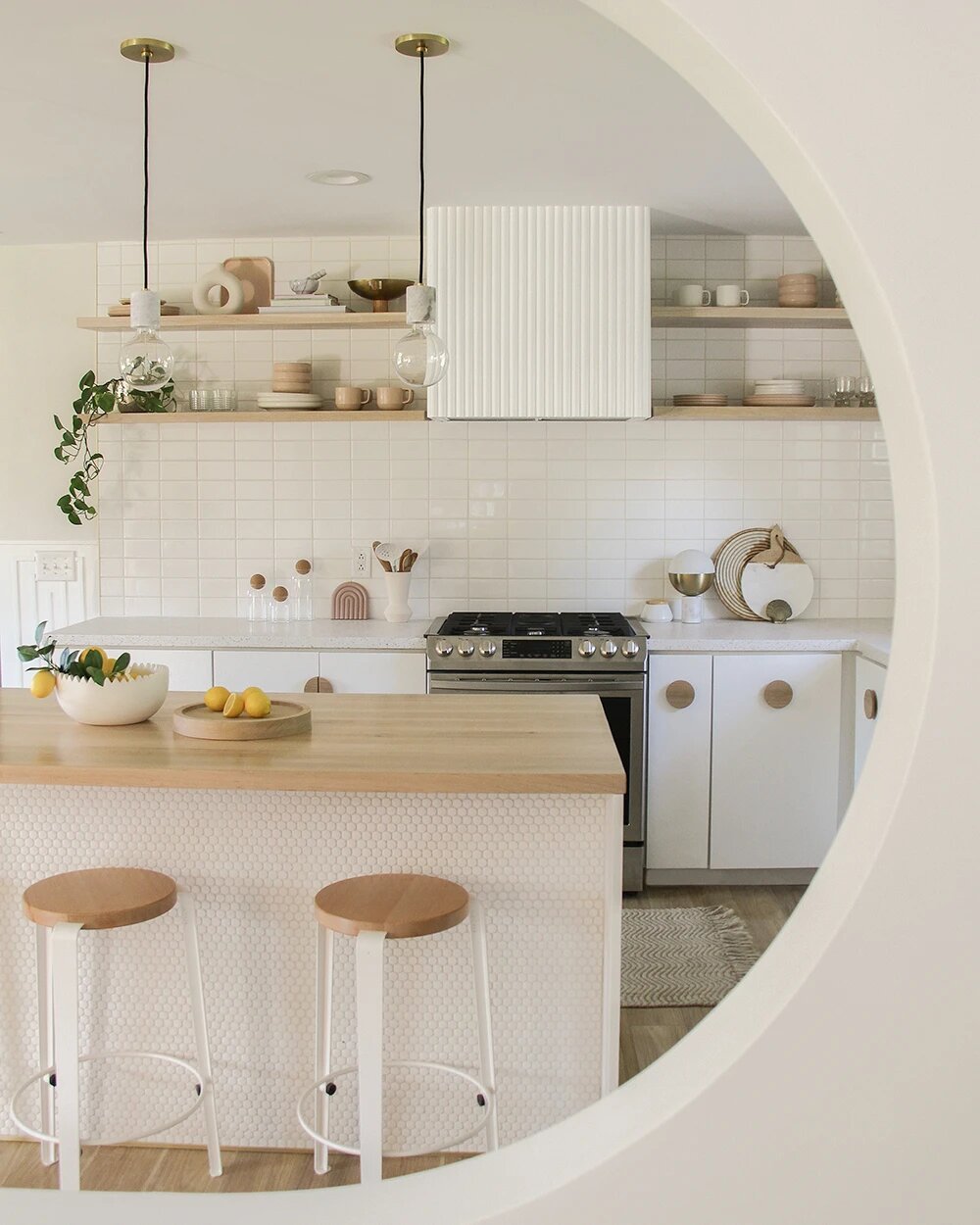
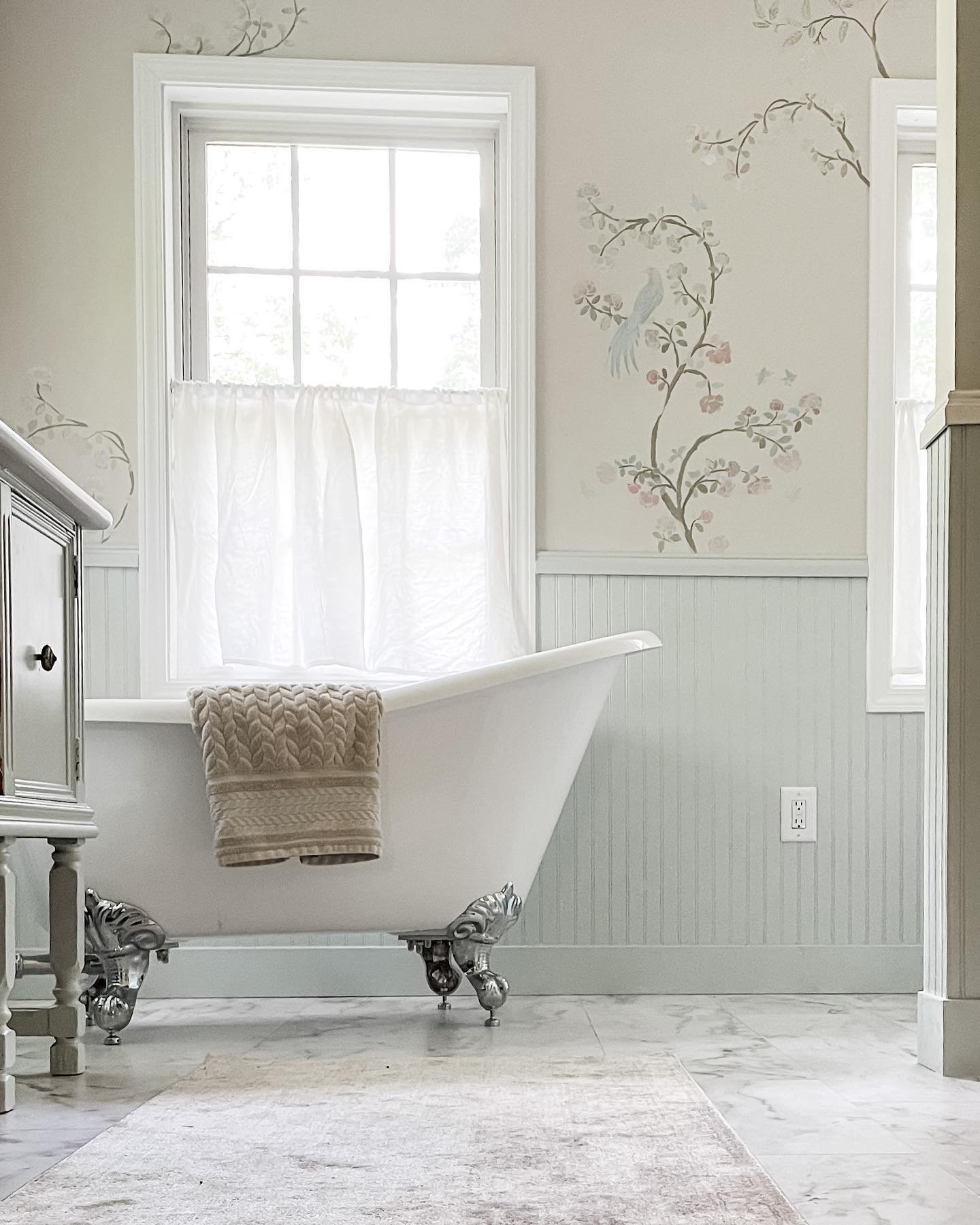
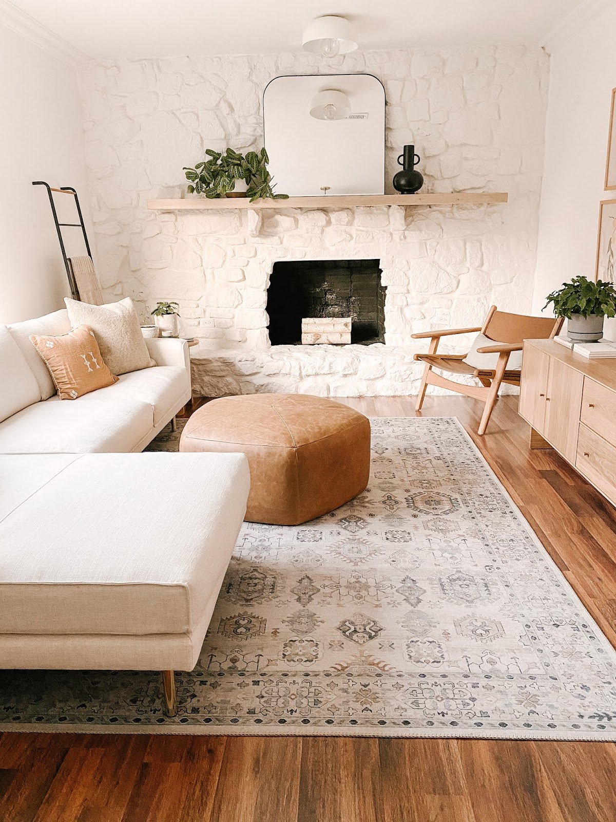
Low Contrast: Serene and Harmonious
Low contrast, on the other hand, creates a harmonious and calming mood. Low contrast color palettes stick to analogous colors (those next to each other on the color wheel) that are all a similar value. Low contrast color palettes can be light and pastel or moody and dark, as long as no color differs too greatly from the rest.
Opting for a low-contrast color palette in interior design can be a soothing and harmonious choice. Low-contrast palettes create a sense of calm and serenity in a room. They work exceptionally well in spaces where relaxation and tranquility are a priority, like bedrooms. Low-contrast palettes make a room feel cozy and inviting, and they are ideal for those who prefer a subtle ambiance. So, if you're looking for a design that's easy on the eyes and encourages a sense of peacefulness, a low-contrast color palette might be the way to go.
Just like in high contrast spaces, you can use consistent textures, shapes, and sizes of elements to bring down the contrast of a room as well.

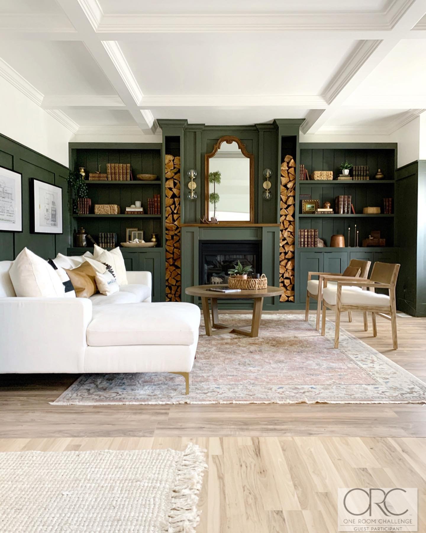
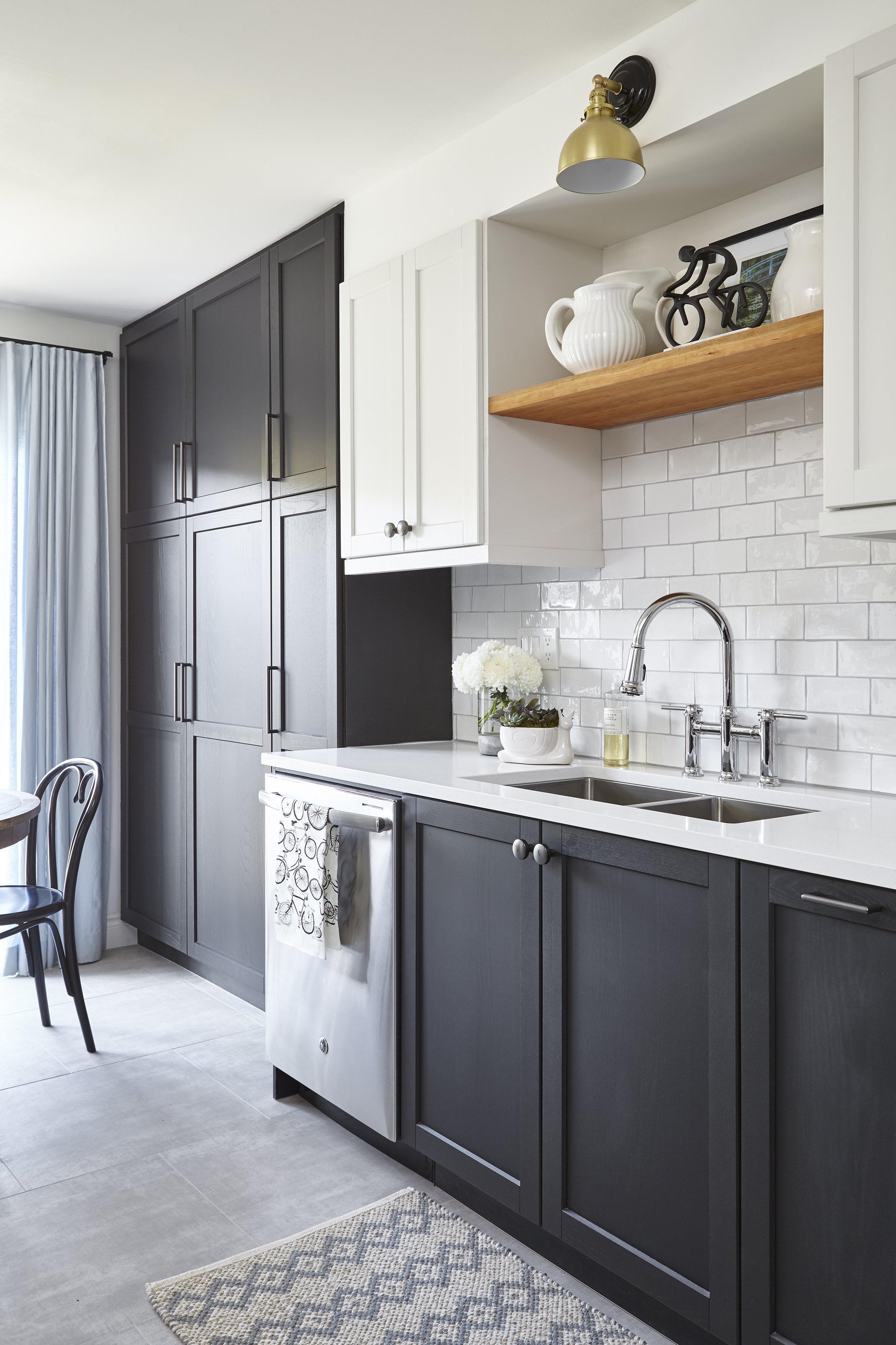
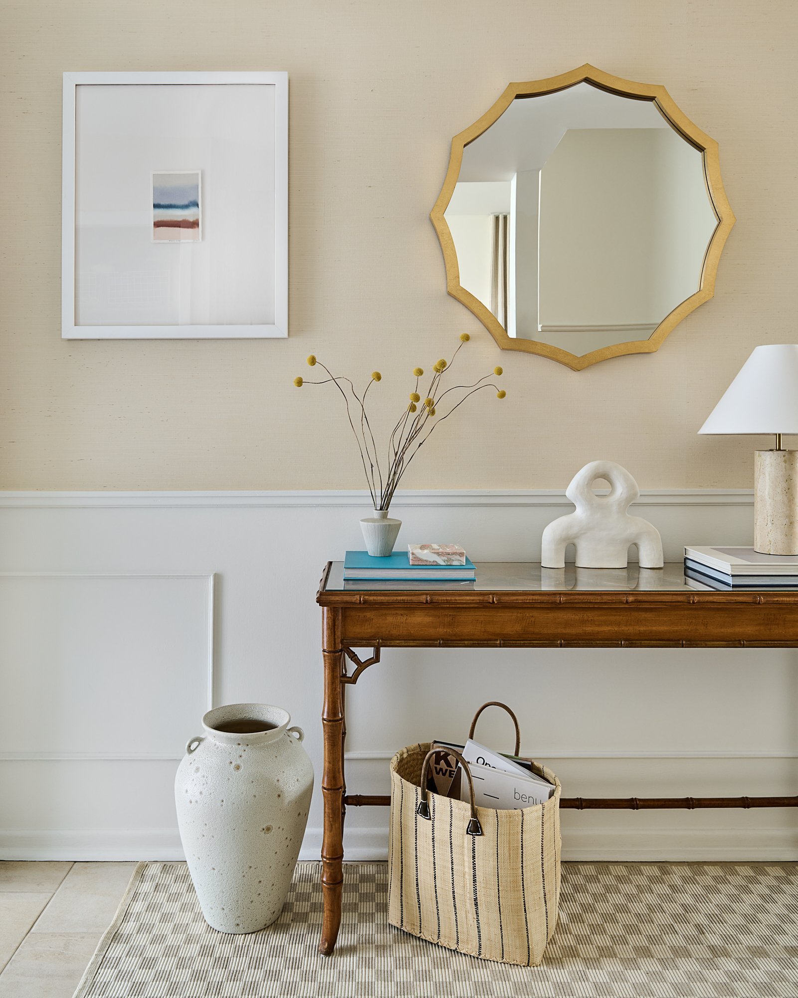
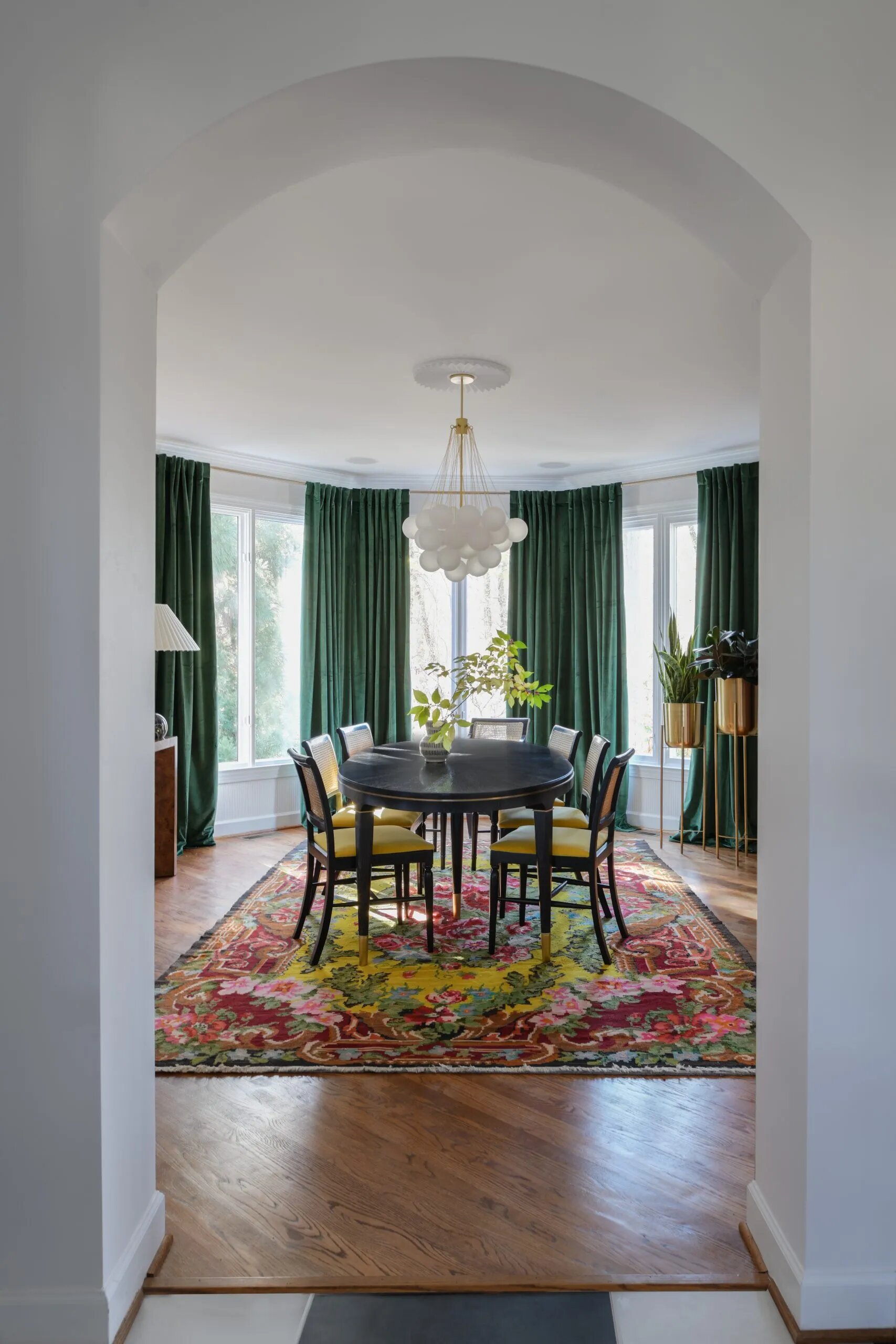
Balancing Contrast
While high and low contrast may seem like opposing design strategies, they can work harmoniously within a single space. In fact, most people prefer for their space to fall somewhere between high and low contrast.
Balanced color palettes are evenly distributed across value and hue. Striking this balance allows you to create a space that's visually engaging without being overwhelming.
Within this balance, you can choose where to use contrast strategically to create focal points in the space. The low contrast elements create harmony, while the high-contrast pops inject energy and personality.
Having this wide range within your palette gives a space depth and character.


Whether you opt for high contrast, low contrast, or somewhere in between, hopefully you now have everything you need to use contrast strategically to set the mood of your space.
Happy designing!