Making the Perfect Gallery Wall With Beth Diana Smith
DESIGN
ARTICLE BY VIRGINIA BESHEARS, IMAGE VIA BETH DIANA SMITH
Gallery walls are a staple of interior design for a reason— they’re a captivating way to showcase art, bring color and texture into a space, and add character to an empty wall.
Creating a great gallery wall is no easy feat, though.
This is Gallery Walls 101, and today we’re learning from the brilliant Beth Diana Smith and the amazing gallery wall she created during her spring ‘20 One Room Challenge® project.
VIA BETH DIANA SMITH
So you have a wall with the perfect amount of space and visibility to create a showstopping gallery wall. Where to begin?
There are no hard and fast rules— the main objective is balance.
The very best gallery walls look like they’ve been collected over time. A diverse collection of art will bring in so much character and visual interest. Don’t forget to have a wide range of frames as well. Mixing in some vintage frames elevates a gallery wall so much, and gorgeous vintage frames are easy to find at garage sales or Facebook Marketplace.
Balance bold, vibrant pieces with more subdued ones, ensuring that no single artwork overshadows the others. Make sure that larger and smaller pieces are distributed evenly, and make sure spacing is even so no areas feel crowded or bare.
Lay everything out on the floor and make sure you’re happy with the spacing before you start making nail holes in your wall. If you want to be extra precise, you can also use painter’s tape to double check your layout on the wall. It’s typically recommended to have about 2 or 3 inches between pieces in a gallery wall, so you may want to have your measuring tape handy when you’re working on your layout.
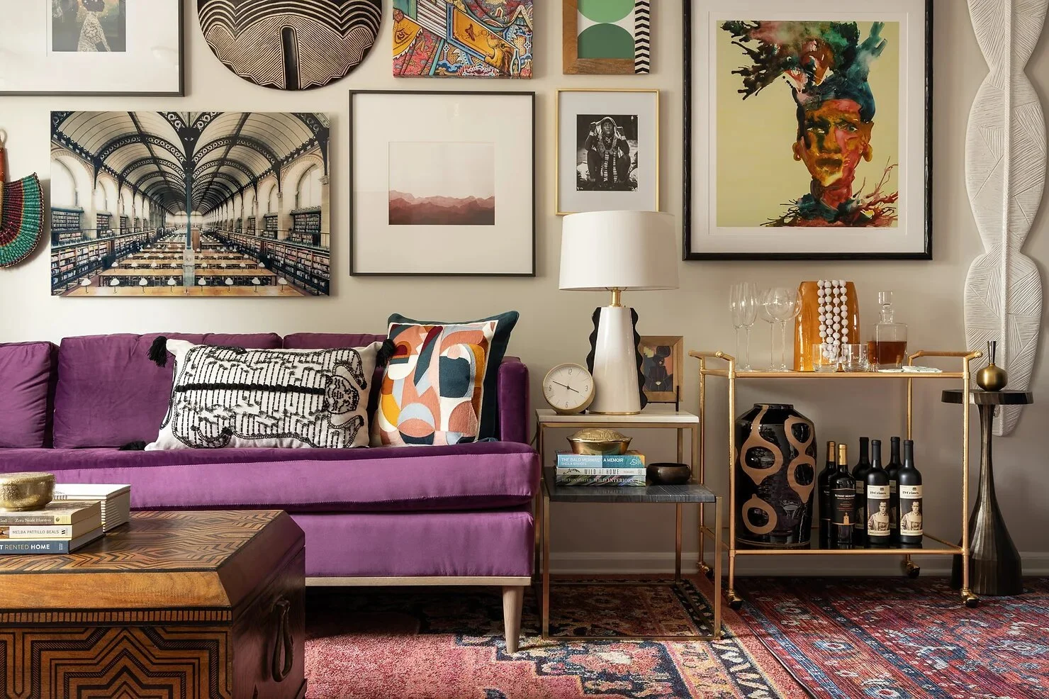
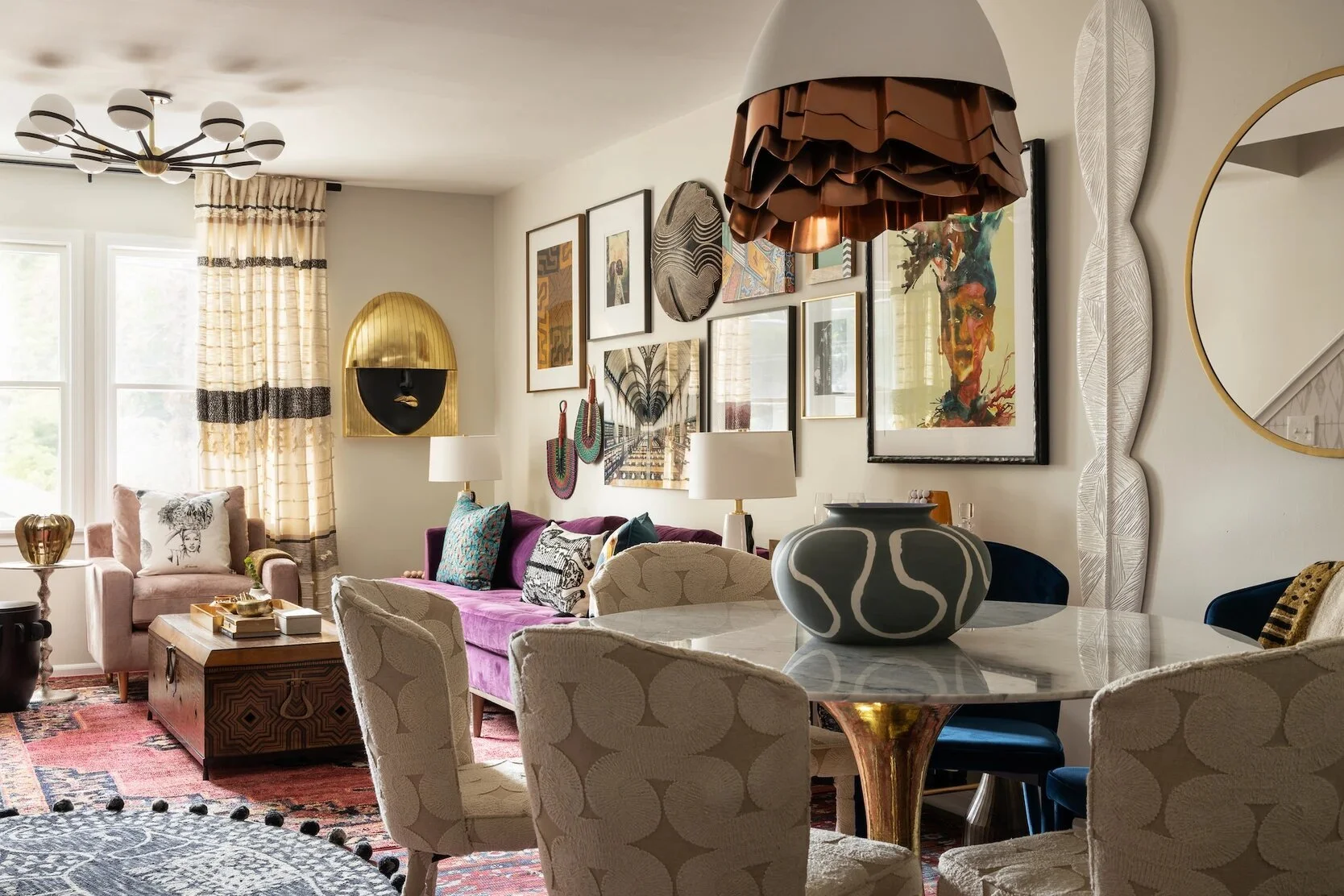
Beth achieved a beautifully balanced gallery wall. The pieces she chose are cohesive and harmonious as a grouping, but are each interesting on their own and diverse enough to create an eye-catching, show-stopping focal point.
The mix of photographs, paintings, and sculptural items looks incredibly natural. They’re eclectic but still clearly represent her style and taste.
Notice how Beth even used the frames as an opportunity to add color, texture, and character.
VIA BETH DIANA SMITH
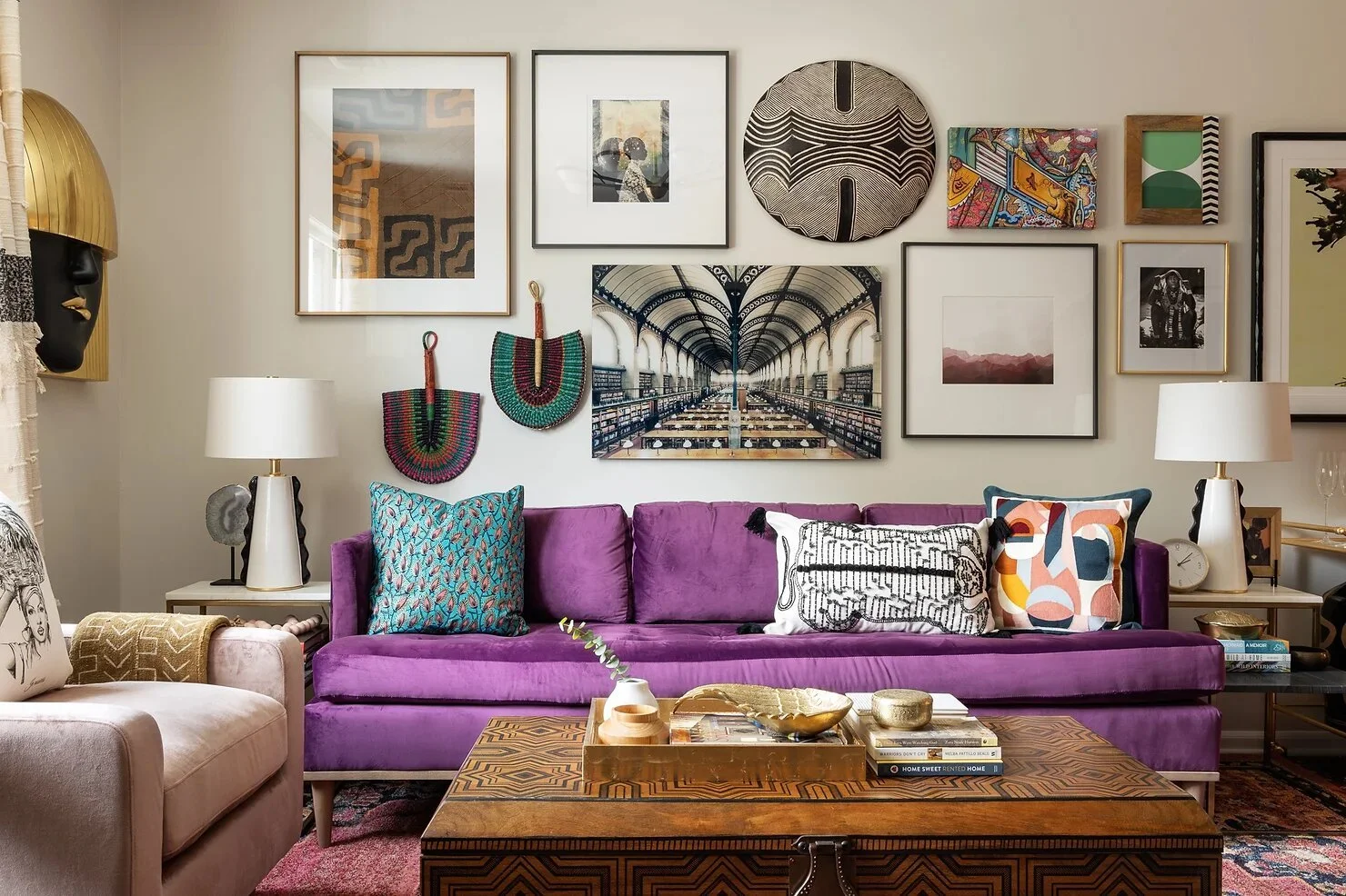
This photo from across the room shows how balanced and captivating the gallery wall is. It feels magnetic.
At the point where the living room meets the dining room, Beth used that amazing 72” tall resin leaf art as a transition to lead the eye either toward or away from the gallery wall. What an inspired detail!
VIA BETH DIANA SMITH
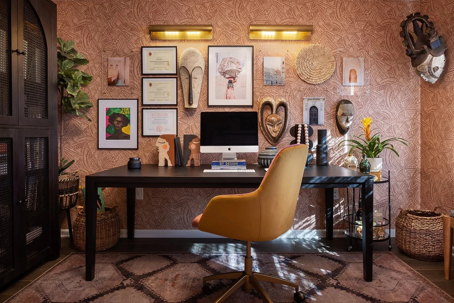
If you’re still in need of more gallery wall inspiration, check out this one, also by Beth Diana Smith, from the fall ‘21 ORC. It’s a real “well, she’s done it again” moment. Since the wallpaper is already so intricate, she went with mostly softer colors and natural materials that wouldn’t conflict.