9 Rooms That Use Bold Colors In Inspiring Ways

9 Rooms That Use Bold Colors In Inspiring Ways
STORY BY VIRGINIA BESHEARS, PHOTO BY MIKA BAUMEISTER
Mastering the art of color in interior design is no easy feat.
Below are ten inspiring ORC projects that use bold colors, plus tips on incorporating bold colors into your space like a pro.
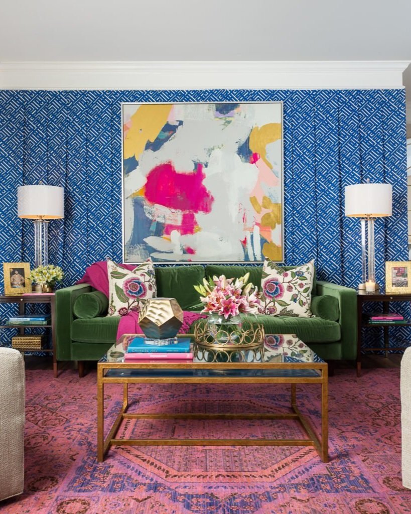
Choosing a wallpaper or textile that has a pattern can be an excellent way to incorporate bold color. It works especially well in this space because she’s chosen two patterns with very different scales, plus a large-scale painting that ties the room together.
VIA IBB DESIGNS

Gem tones like this emerald make a big statement while also looking very sophisticated and luxurious. Pairing it with lots of white creates high contrast and keeps the room feeling airy.
VIA JESSICA BRIGHAM

This color pairing works so well because not only are they opposite each other on a color wheel, but they also differ in tone. Using the much stronger of the two as the accent color draws your eye right to the focal point of the room.

A great trick you can use to choose your color scheme is the 60/30/10 rule: choose a softer, more neutral color to cover roughly 60% of a room, a bolder color to cover 30% of the room, and an eye-catching accent color to cover 10% of the room. In this fantastic laundry room, the pink occupying the 30% role is balanced by the white (60%) and the black (10%).
VIA REBECCA PROPES

Medium sized rooms can handle quite a bit of color — bold colors doesn’t feel overwhelming the way they sometimes can in a very small or very large space. In this bedroom, the art at the focal point ties all the color choices together.
VIA OUR CASITA
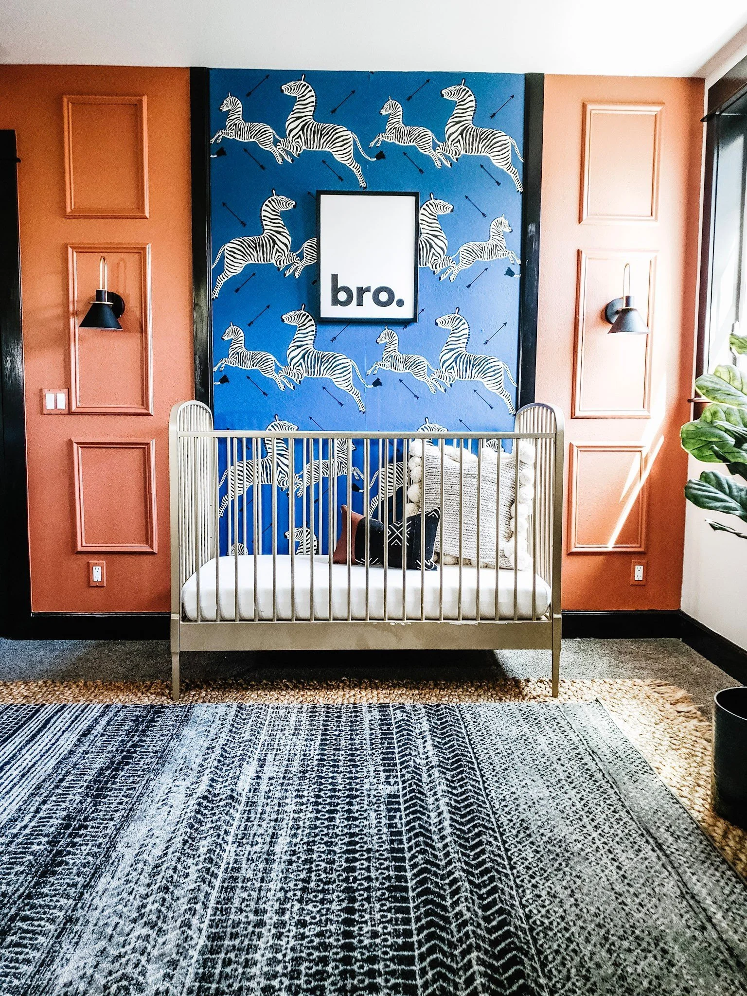
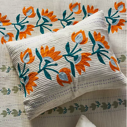
Kids’ rooms are a great place to make creative color choices. This complementary color pairing of orange and royal blue feels so whimsical and exciting, and it’s grounded by a more neutral rug.
VIA CRAVEN HAVEN

This cool-toned, softer blue looks amazing paired with a very bright red. The blue is saturated enough to hold its own against the red, and the red has been used very sparingly to not overwhelm the space. Overall, the space looks very cheerful.

Such a bold color choice in a laundry room feels so unexpected and makes the space feel really special. The metallic accent pattern on the wallpaper helps to break up all the teal and keep it from overwhelming the space.

This space has only a splash of a bold blue, but just that small amount sets the tone for the space. Mirroring the blue in the light fixture on the far wall helps the accent color feel more integrated in the room.
VIA PALM AND PREP
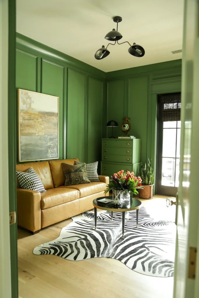
This gorgeous green on the walls works so in this study space because it’s been balanced with so many neutrals, like the leather couch and the black and white graphic rug. It feels both warm and serious.
VIA OUR FIFTH HOUSE
BRING SOME BOLD COLOR INTO YOUR SPACE