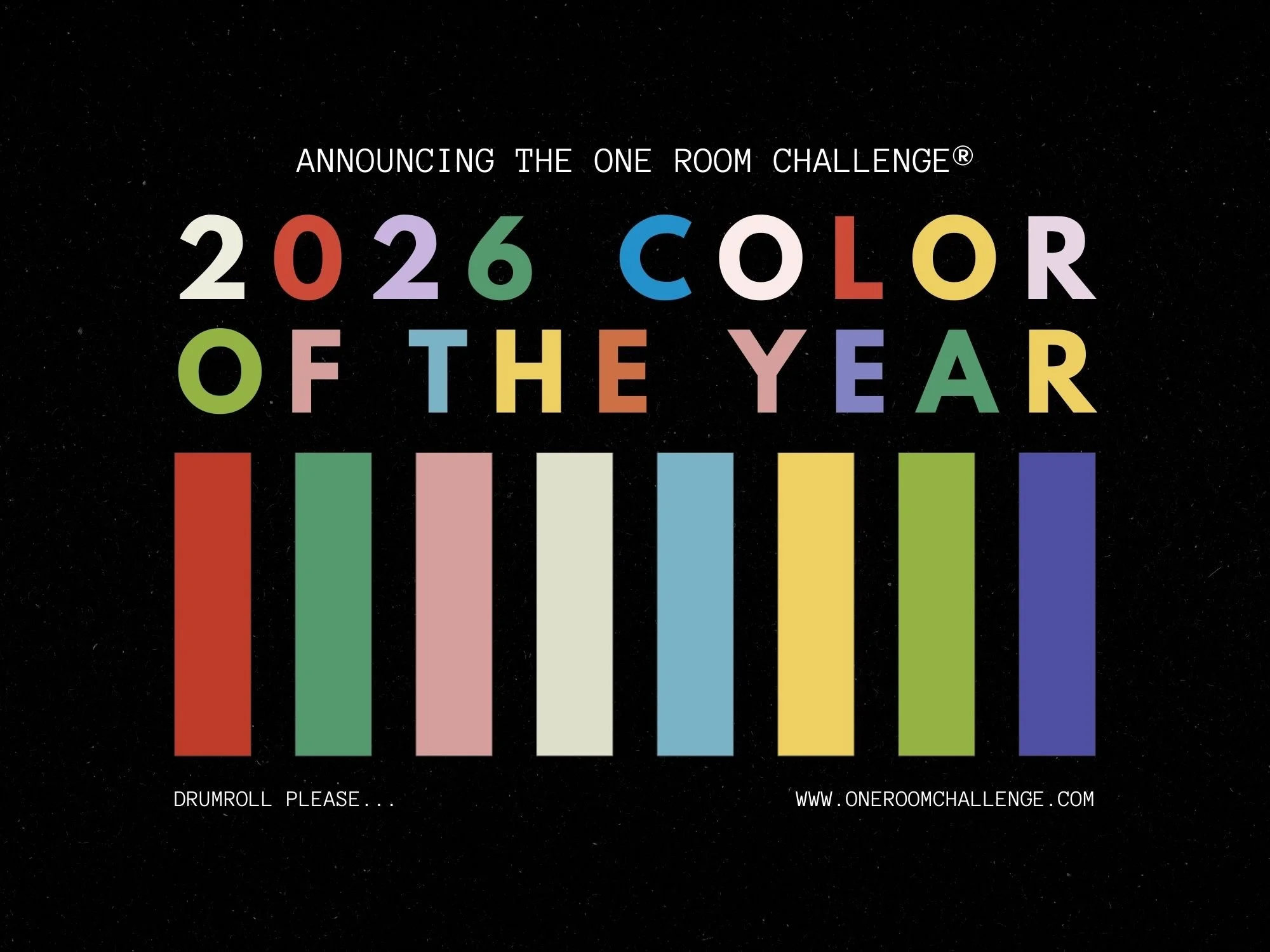
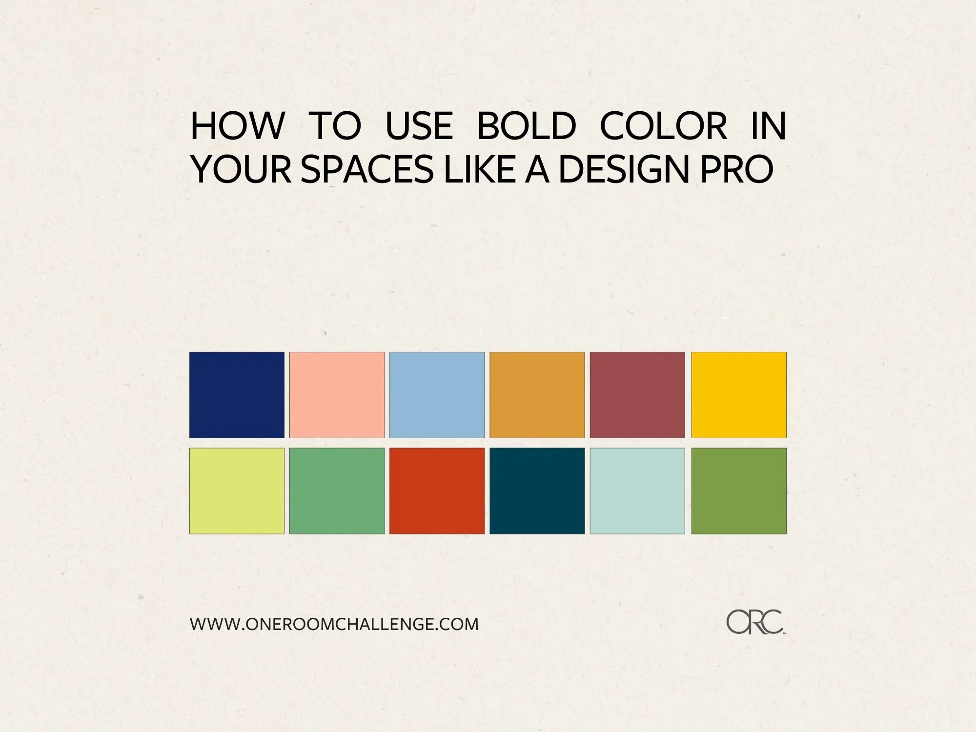
How to Use Bold Color in Your Spaces Like a Design Pro
DESIGN
story by Virginia Beshears
Every room needs bold or dark color to feel balanced and grounded. But, choosing colors for your home is a huge undertaking, and it isn't made any easier by how intimidating bold or dark colors can be.
When you bring in those bold colors in a smart, thoughtful way, they create visual weight and depth that makes spaces feel professionally designed and intentional.
Below are a few strategies for bringing bold color into a space, plus bold color inspiration via a some fantastic ORC projects.
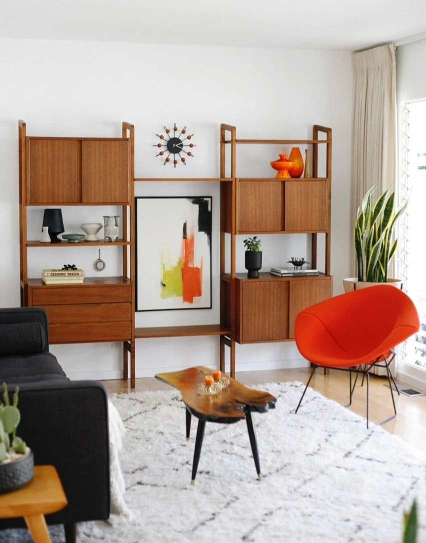
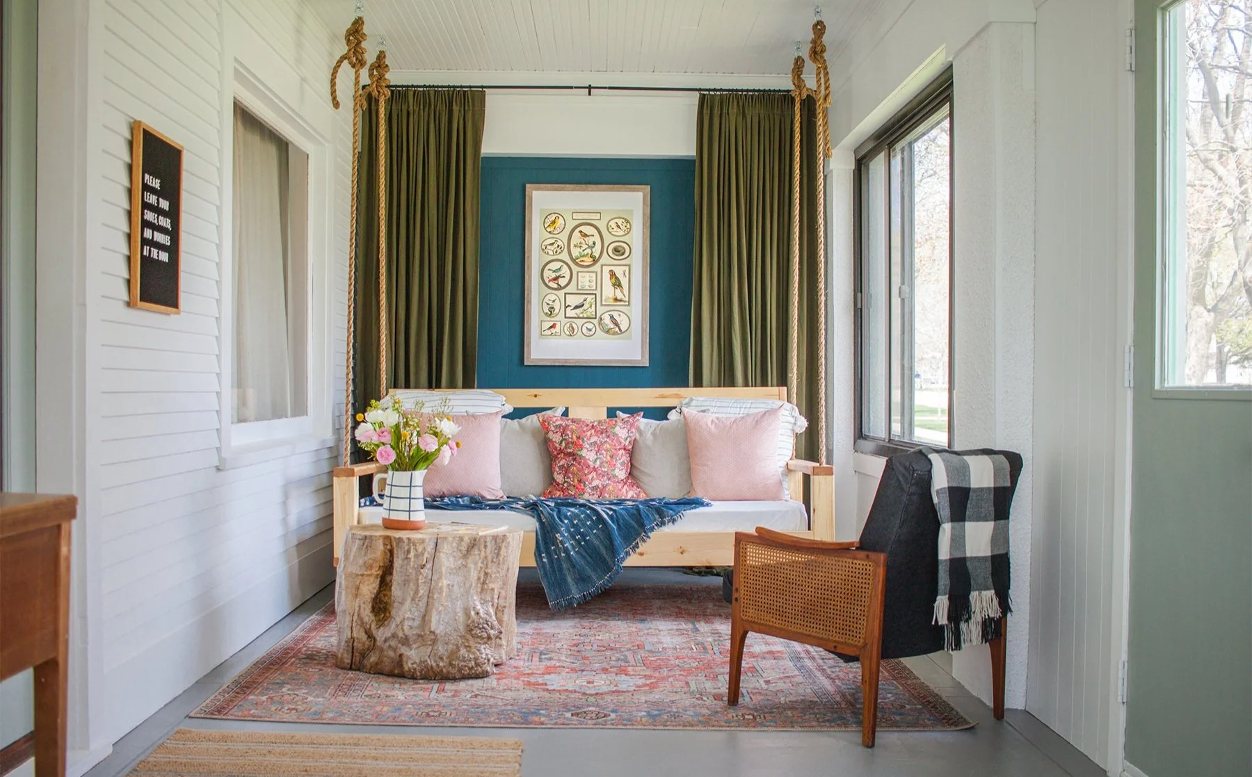
via Suburban Pop
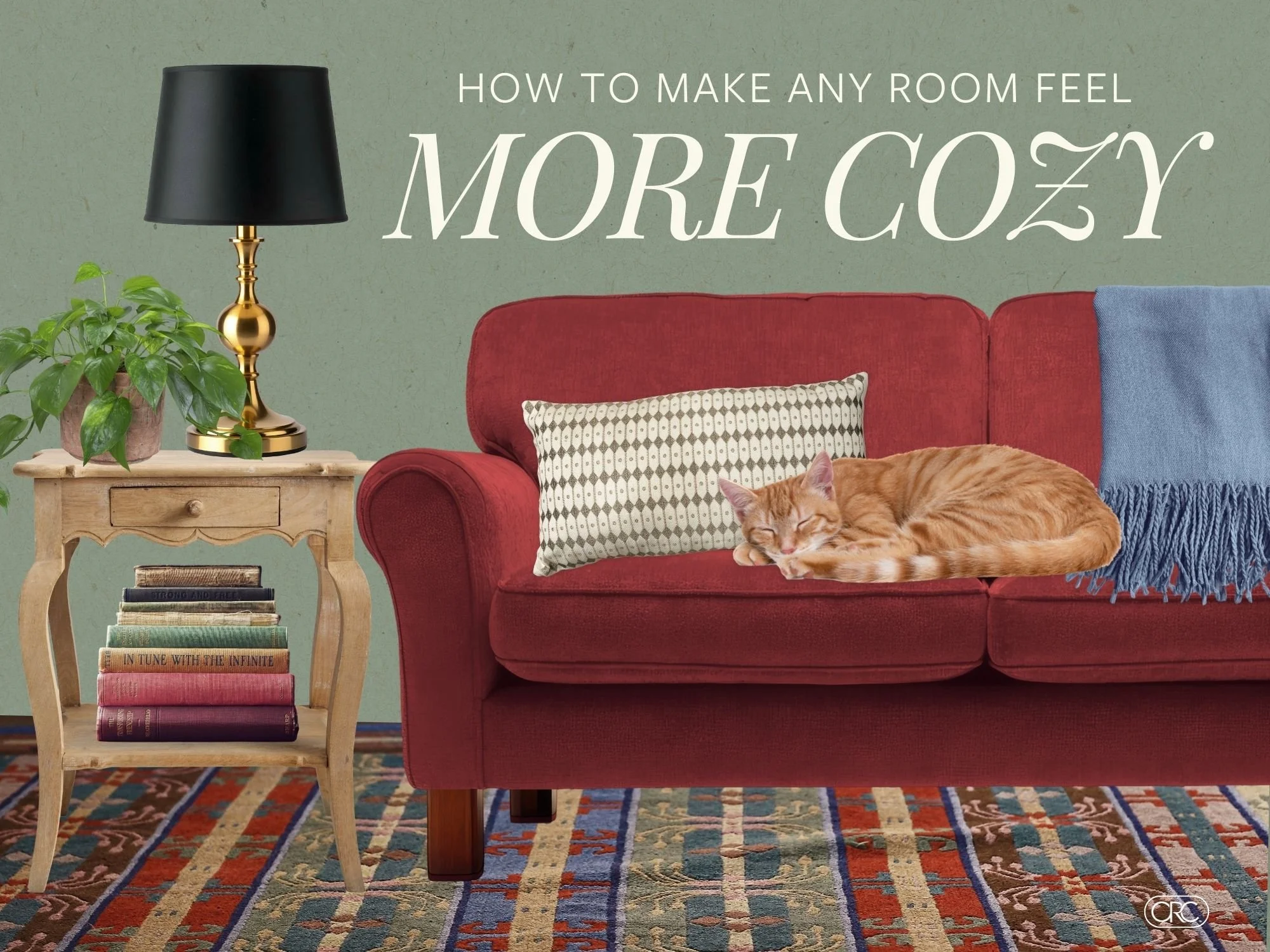
Harmony through repetition
Harmony through repetition is the Old Reliable of bold color strategies. You choose one bold color and repeat it in three to five different spots throughout your room. This creates a visual rhythm that feels cohesive and intentional.
Why it works: When your eye sees the same bold color repeated around a space, it reads as a deliberate design choice rather than a random pop of color. The repetition creates balance and makes even the boldest colors feel harmonious.
How to execute it: Start by choosing your bold color – maybe it's a rich burgundy, a vibrant coral, or a deep forest green. Now, instead of using it in one large statement piece, break it down into smaller doses:
A throw pillow and matching lamp shade
Picture frames and a small side table
A piece of artwork and fresh flowers in a coordinating vase
Decorative objects and a cozy throw blanket
The key is varying the sizes and textures while keeping the color consistent. You might have a large piece (like a piece of art), a couple of medium pieces (like pillows), and several small pieces (like decorative objects or books).
Pro tip: One of those echoes should be close to eye level when you're seated in the room – this ensures the color feels integrated rather than just scattered around on surfaces.
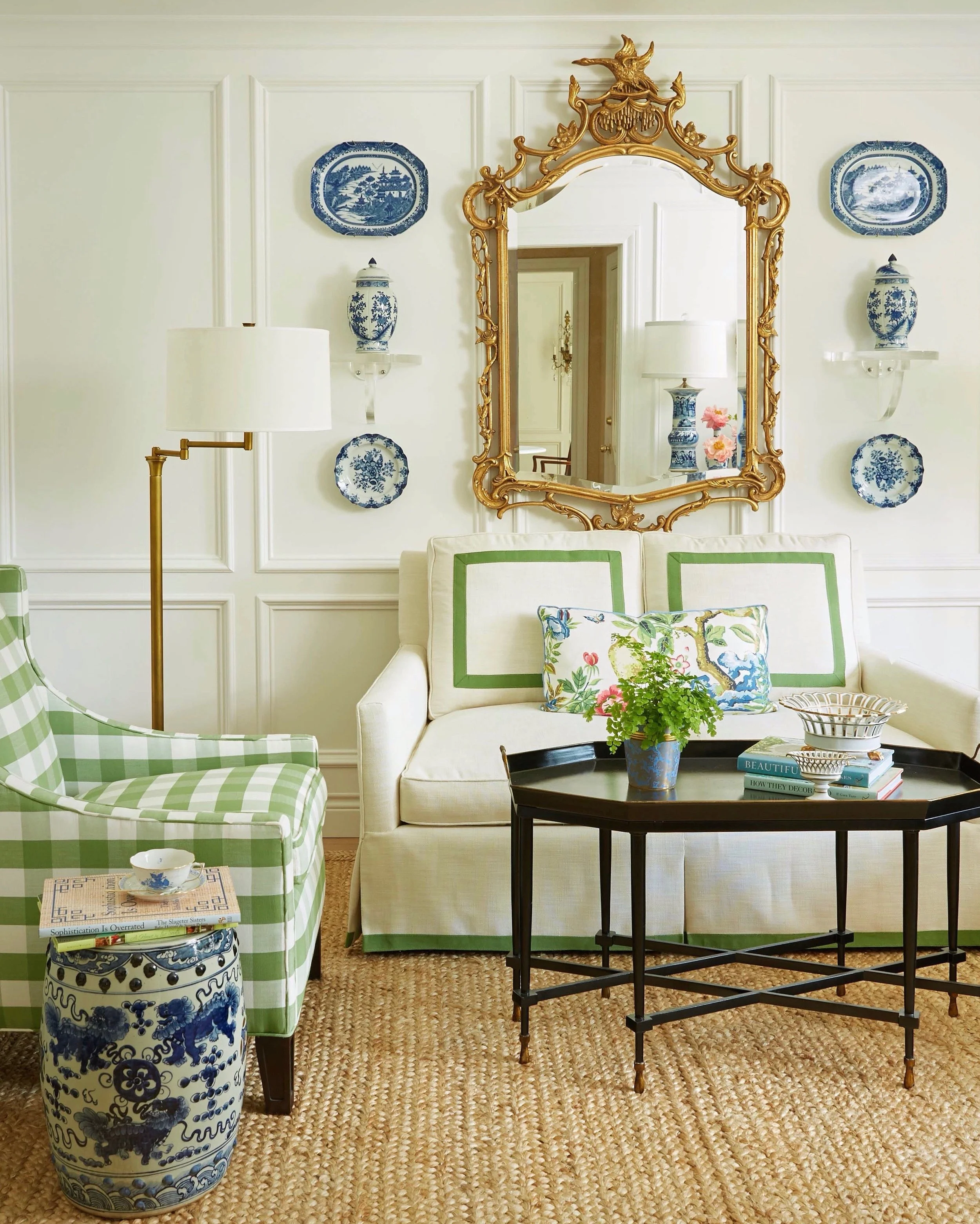
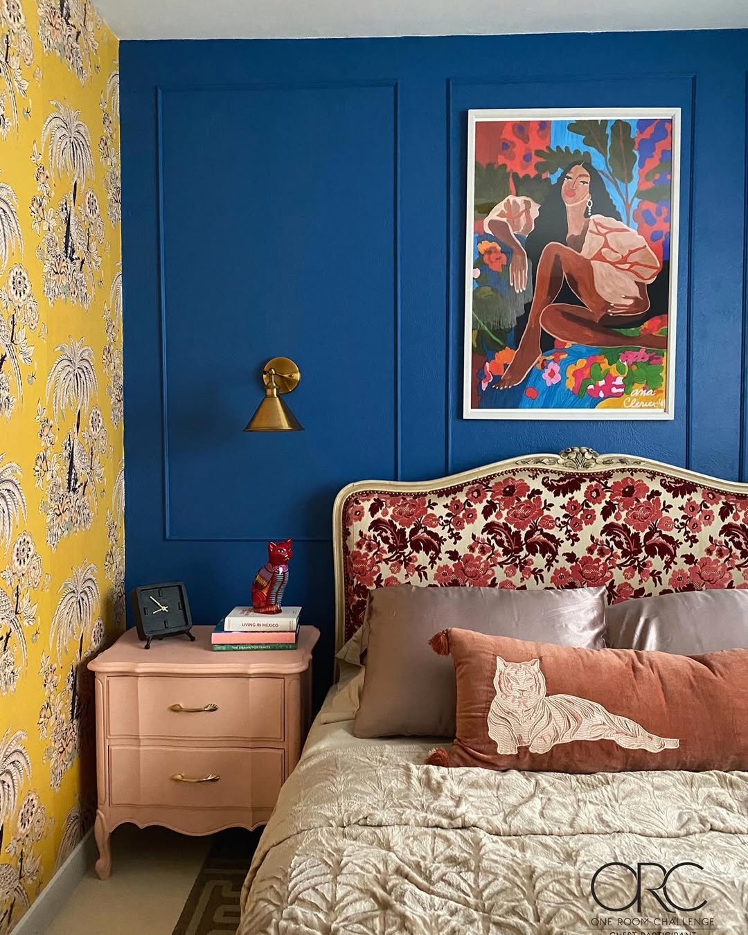
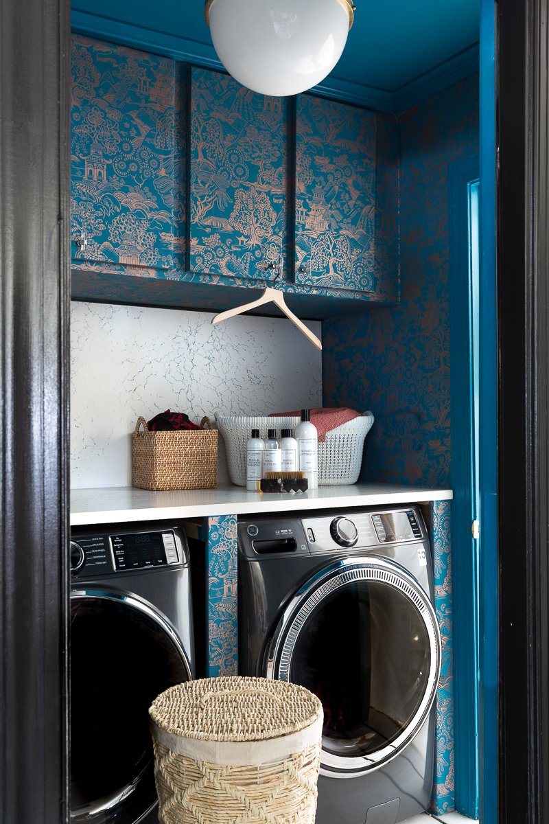
via The Pink Pagoda
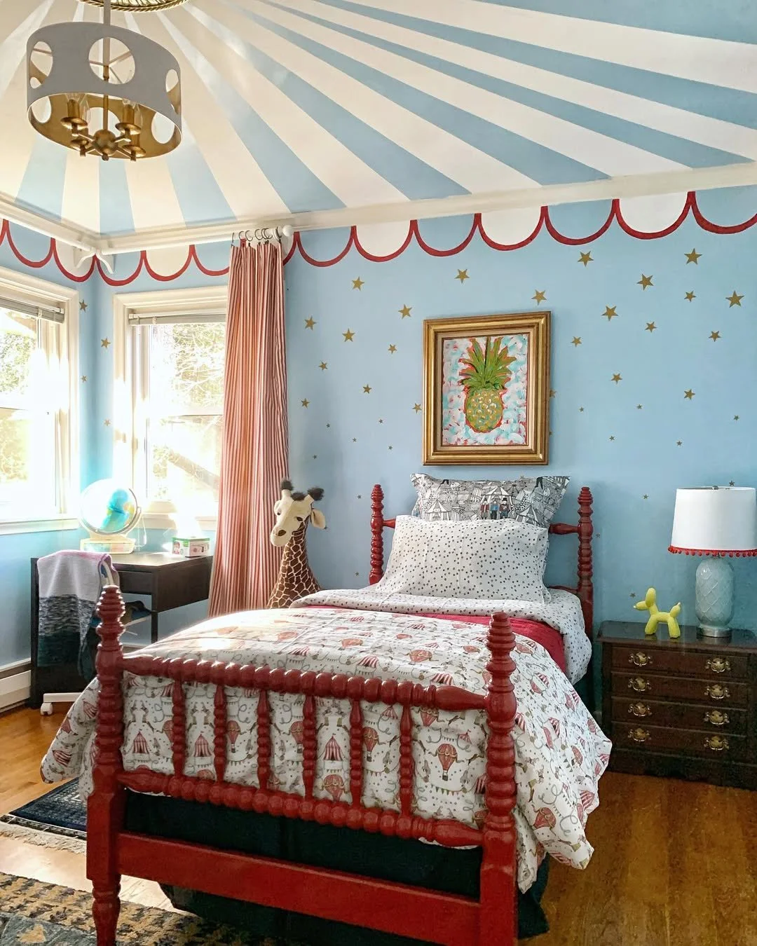
via Jessica Brigham
The Layered Approach: Build Depth with Color Intensity
Strategy #2 is similar but goes one step further. With the layered approach, you incorporate a family of related colors that range from deep and dramatic to soft and subtle. It's like creating a gradient that adds depth and richness to your space.
Why it works: Layering different intensities of the same color family creates visual interest without overwhelming the space. It also allows you to incorporate bold color gradually.
How to execute it: Pick your base bold color and then find three to four variations of it:
The deepest, most saturated version (your true bold color)
A medium-intensity version (about 50% lighter)
A soft, muted version (very light but still recognizable)
Consider adding a slightly different tone (like adding brown undertones to a blue family)
For example, if you love navy blue, you might use:
Deep navy for a dramatic accent chair
Medium blue for throw pillows
Soft powder blue for window treatments
Denim blue for a casual throw blanket
This creates an incredibly sophisticated look that feels both bold and livable.
Pro tip: Start with your lightest version in the largest quantities, then gradually decrease the amount as you move to deeper shades. This keeps the room from feeling too heavy while still giving you that bold color impact.
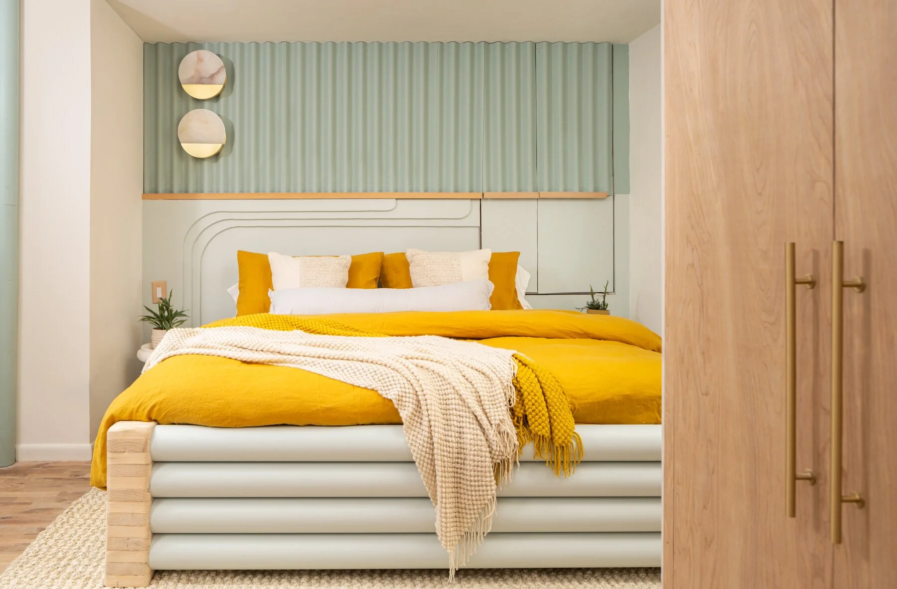
via Benson Dwelling
via Our Casita

via IBB Design
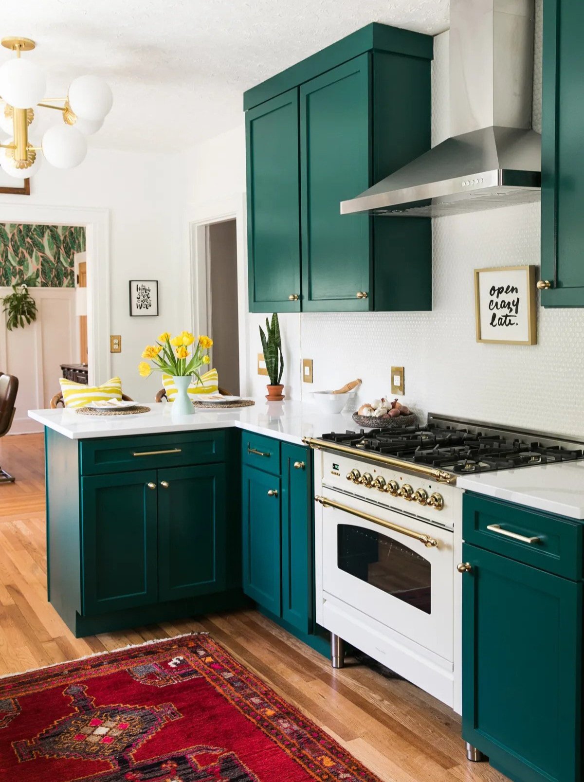
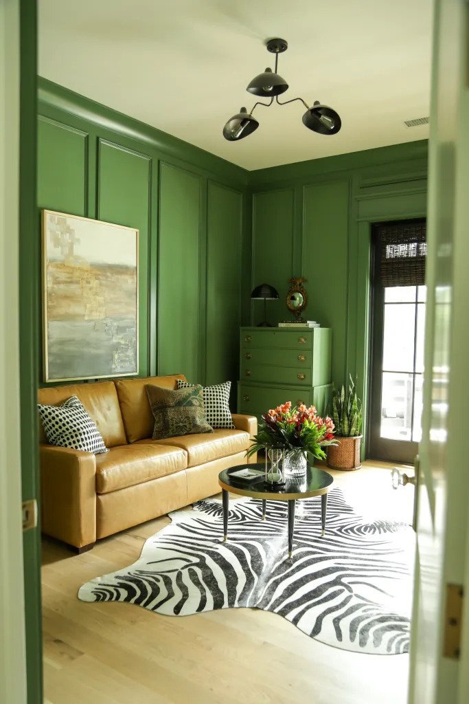
The Anchor Strategy: Ground Your Space with Visual Weight
This strategy is all about using bold and dark colors to create visual "anchors" that ground your room and prevent it from feeling ungrounded or unfinished. Think of it as adding weight to a balloon so it doesn't drift away.
Why it works: Light, bright rooms can sometimes feel unbalanced or incomplete. Adding strategic touches of bold or dark color creates visual weight that makes a space feel more substantial and professionally designed.
How to execute it: Look for opportunities to add bold or dark color in unexpected places that will anchor your room:
The inside of built-in bookshelves painted in a rich, dark color
A dramatic area rug with deep colors
A stack of books that have bold colors on the covers/spines
A coffee table in a darker wood tone
The key is choosing at least a couple of spots where the bold color will feel architectural rather than decorative. These anchors should feel like they belong to the bones of the room.
Pro tip: Don't be afraid to go really bold with your anchors – because they're used in smaller doses and in architectural elements, they can handle more intensity than you might think.
via Our Fifth House
Putting It All Together
The beauty of these three strategies is that they work together. When you distribute bold color thoughtfully throughout a room instead of concentrating it in one spot, you create spaces that feel balanced, intentional, and absolutely gorgeous.
Bold color isn't intimidating when you know how to use it like a pro. It's one of the most powerful tools you have to create spaces that feel uniquely yours and absolutely stunning.